
Sinai’s first modern phone store.
El Zbarky Phone needed a brand to match its ambition. We created an Arabic wordmark and a visual identity that customers can recognise across social media, packaging and print.
Give the name a presence of its own.
The identity had to be distinctive in a busy phone market and practical enough for everyday use. We made the Arabic name the main feature, so the brand is recognised through its own name.
A clear mark. A consistent system.
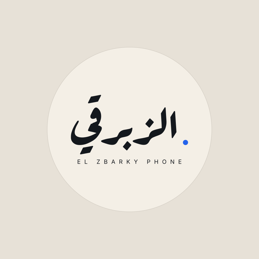
The Arabic wordmark leads, with EL ZBARKY PHONE beneath it and one cobalt dot as an accent. Bone and ink versions keep the logo clear on both light and dark backgrounds.
A focused colour palette and simple type rules make each application feel part of the same brand.

#F4EFE6#14181D#2563EBPrimary and inverse lockups, with an Arabic-only mark for small spaces. Aref Ruqaa for Arabic; Inter for English.
Ready for the places customers see it.
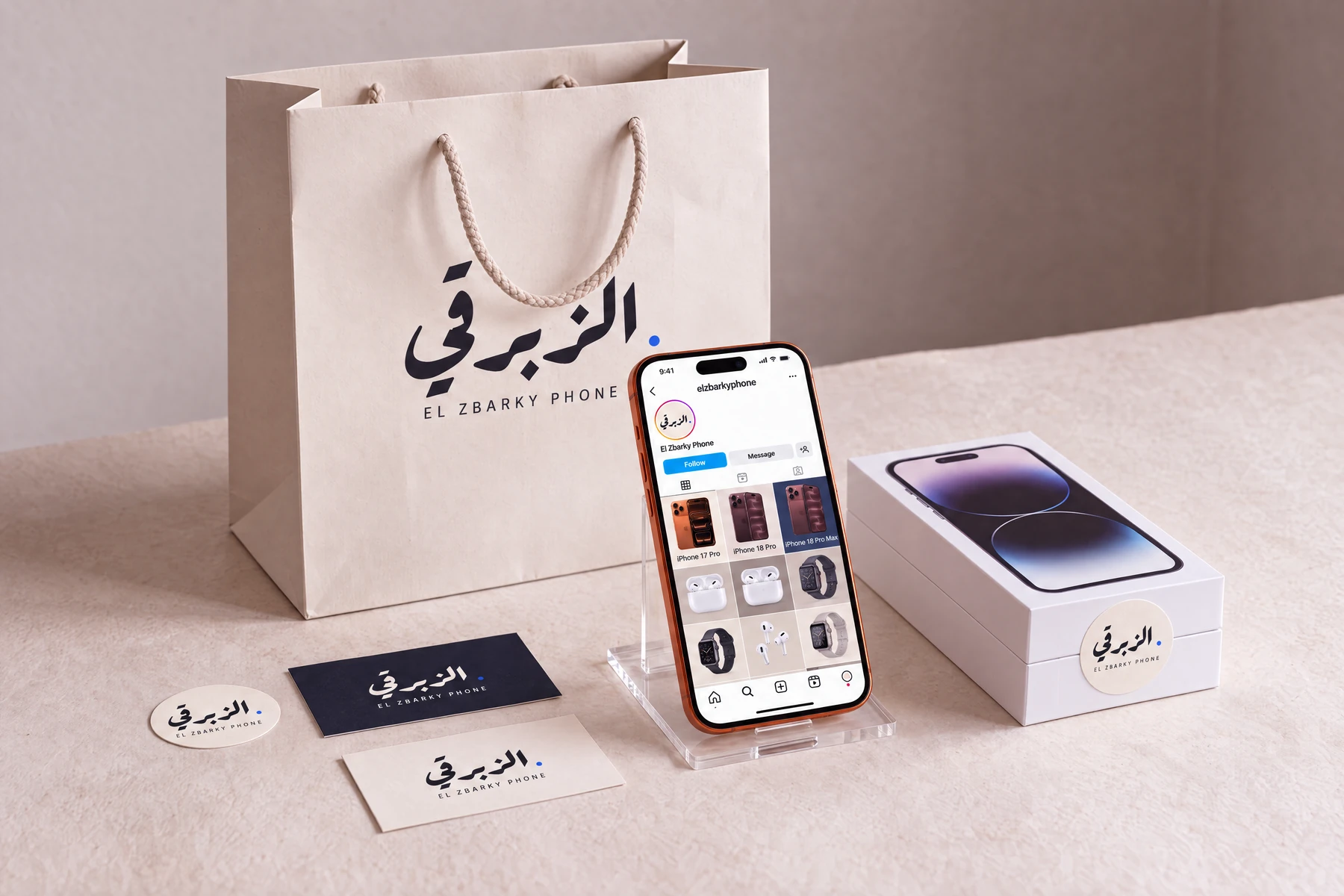
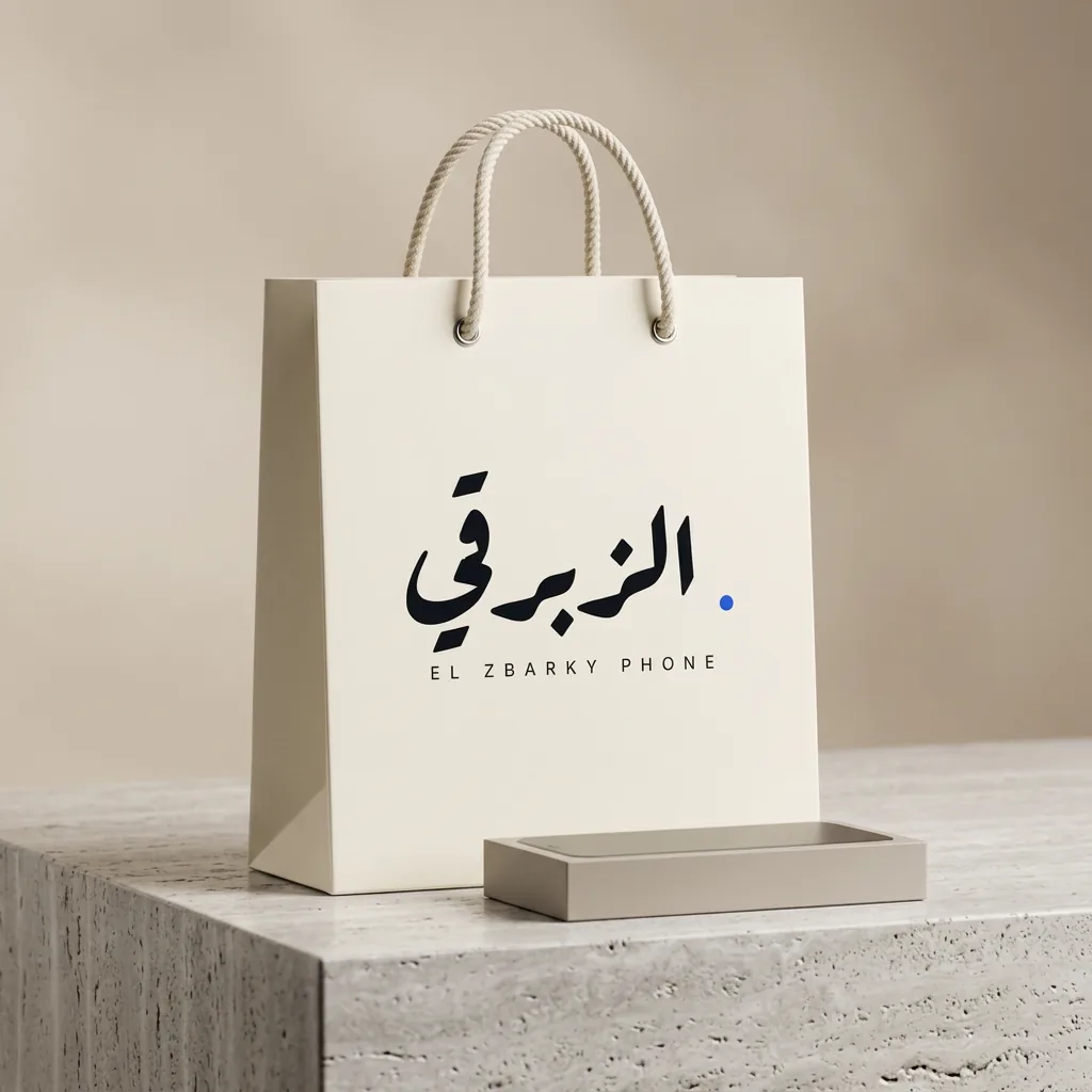
We delivered the logo variants and guidelines for colour, type and spacing. We then showed how the identity works on a bag, box seal, business cards and an Instagram feed.
The result is a usable system the business can carry into new materials as it grows.


Make your business easier to recognise.
A strong identity should work wherever customers meet you. Tell us about your business and the places your brand needs to appear.